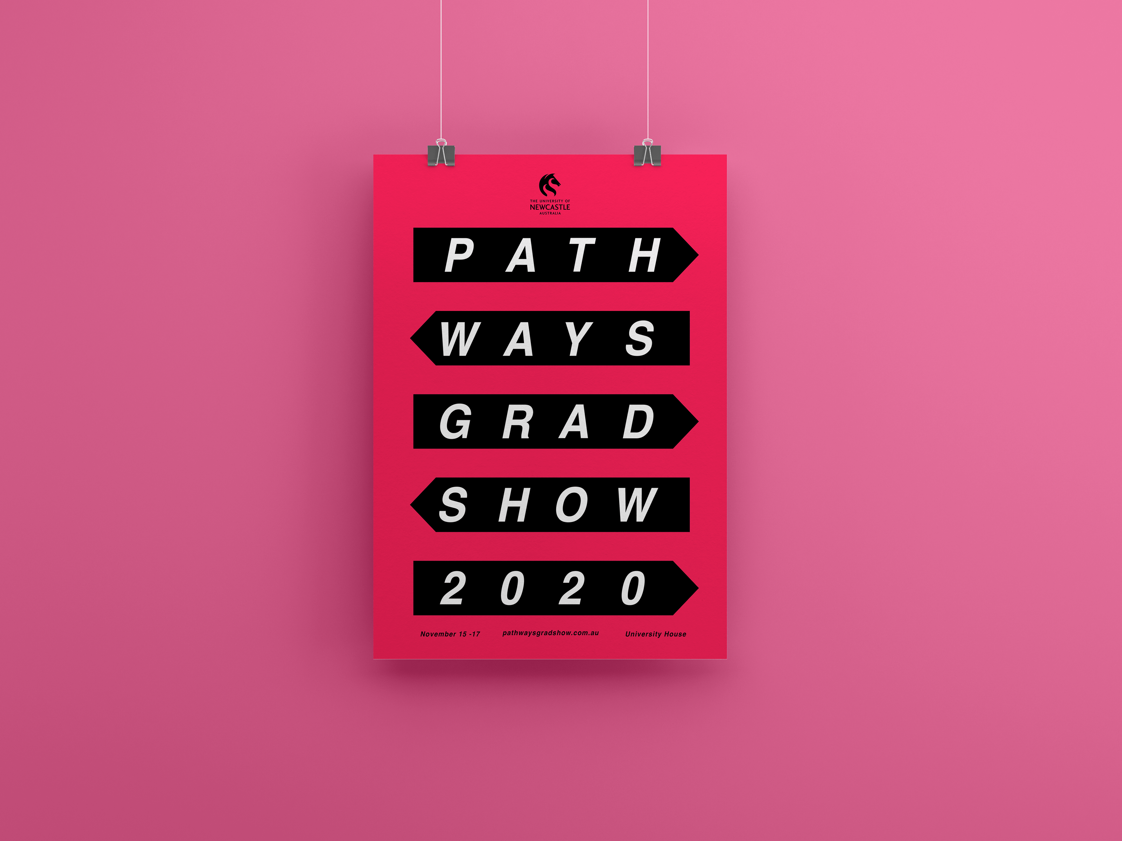
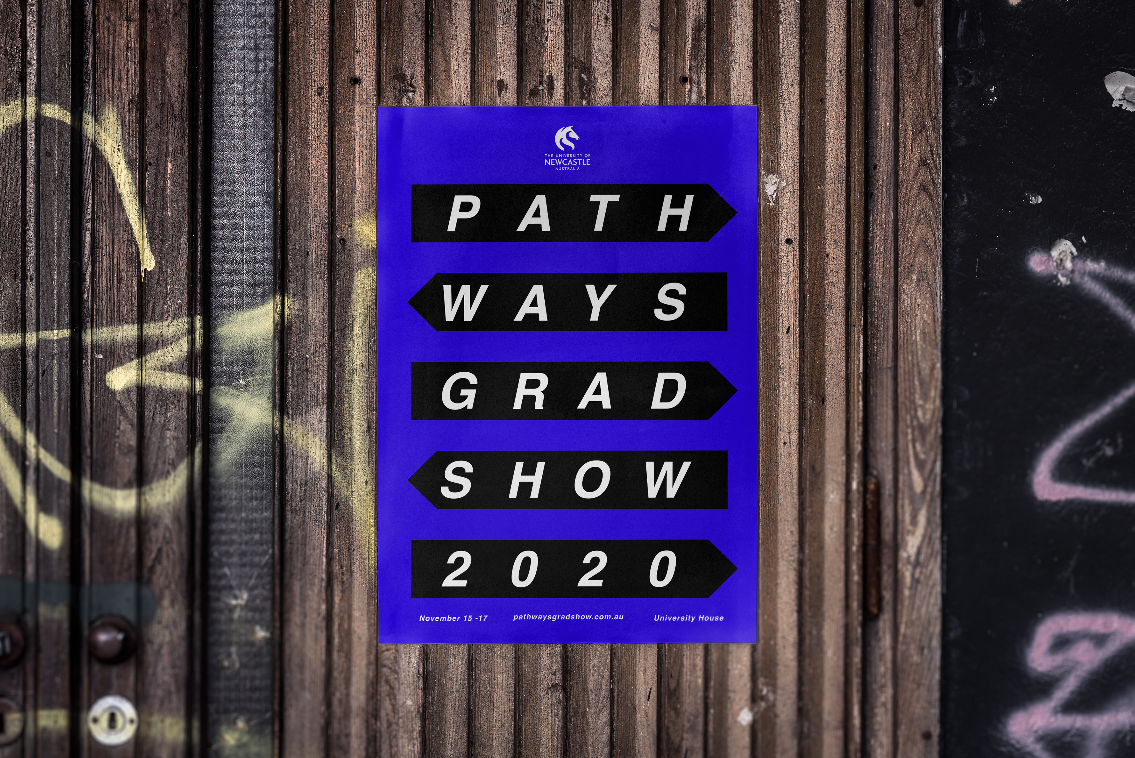
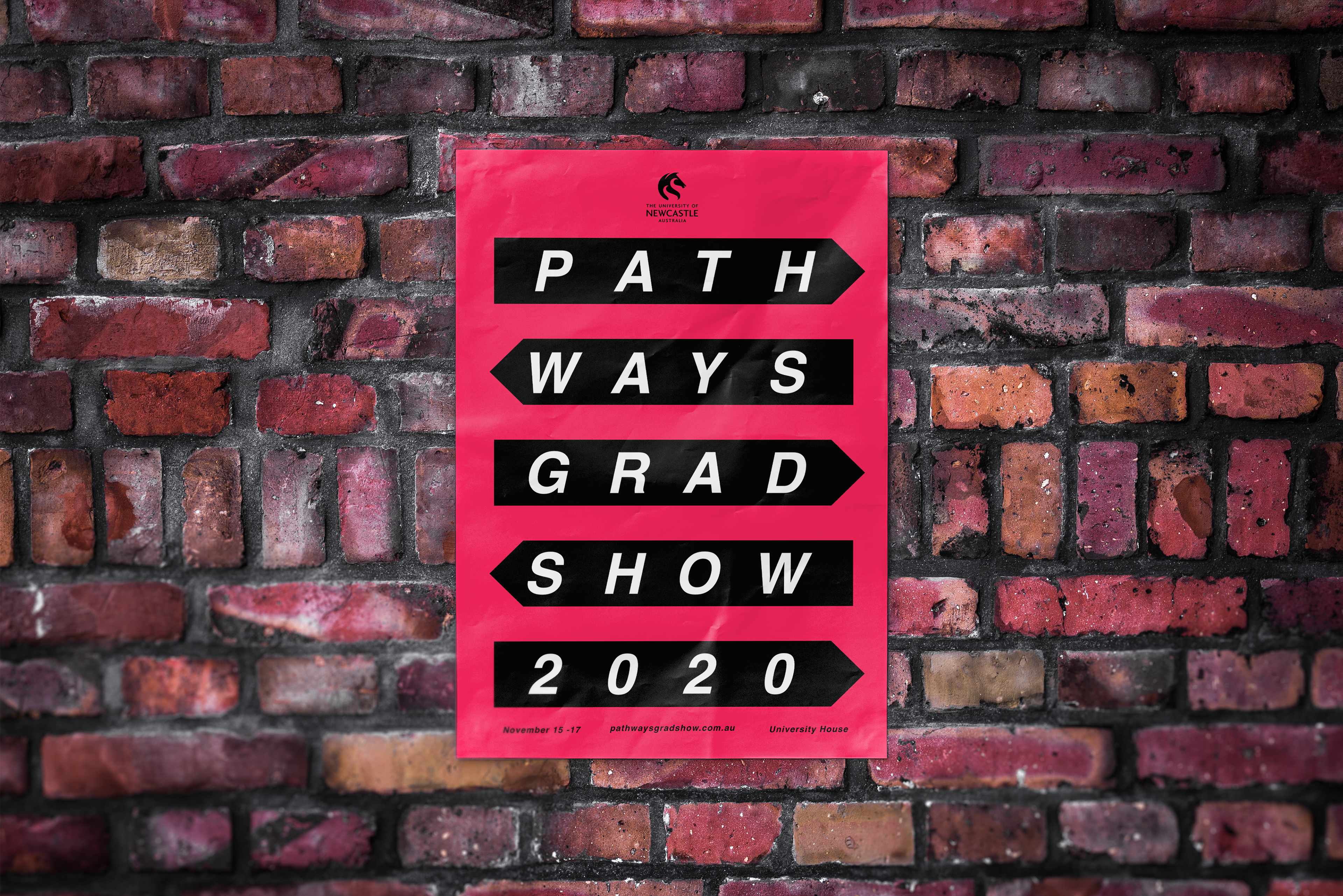
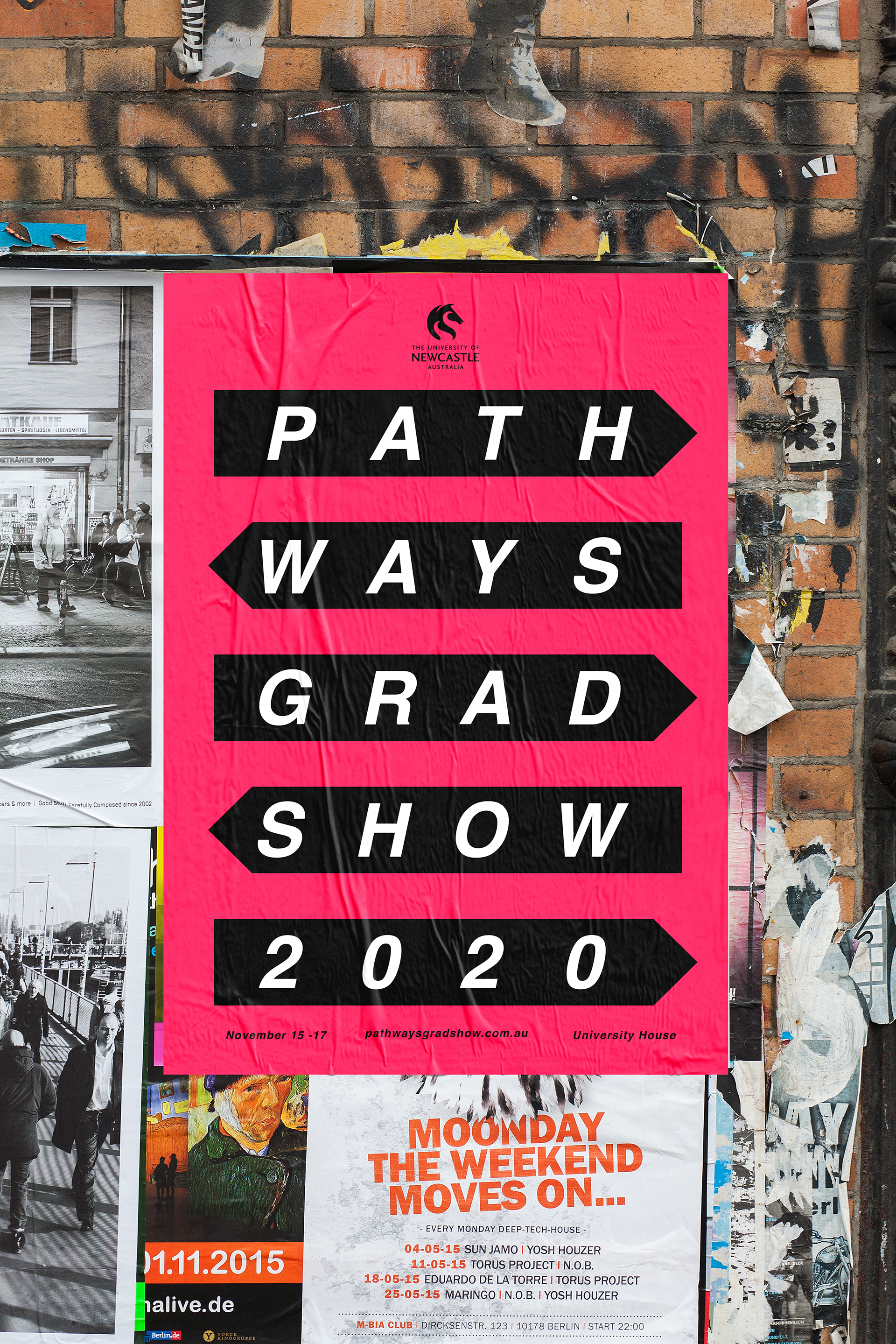
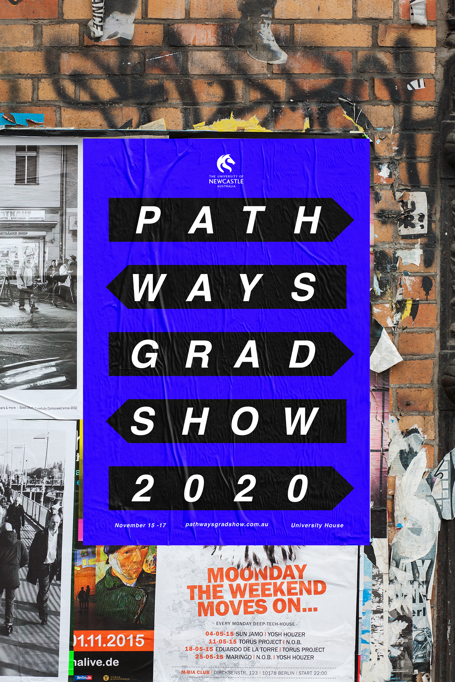
I designed a series of posters for the concept 'Pathways' as part of a submission for the visual communication grad-show. When designing posters, I believe a designer should avoid over saturating the design with too many elements as many posters speak for themselves. Therefore I wanted a design that would be able to stand out on a street corner or wall, so I opted for a neon colour palette and a minimalist design style to engage audiences from a distance.
Here are a few mock-ups of what the posters would look like out in the big wide world!